

Introduction
The React component library space has never been more competitive — or more confusing. In 2026, shadcn/ui holds an 80% satisfaction score among React developers surveyed (State of React 2024), MUI pushes past 6.7 million weekly npm downloads, and a new generation of animation-first libraries like MagicUI and Aceternity UI are reshaping what "beautiful UI" even means.
So how do you pick one?
We evaluated 20+ libraries on five criteria: installation experience, component breadth, platform coverage, animation quality, and developer ergonomics. We built the same dashboard UI with each. We compared how each one performs on a real Next.js project. And we checked — critically — which ones also work in React Native.
The answer to that last question knocked most libraries off the podium immediately.
Key Takeaways
- shadcn/ui doubled its adoption from 20% to 42% in a single year (State of React 2024) — but it's web-only.
- Only one library on this list ships React Native + Expo support alongside web components from a unified token system.
- MUI leads in downloads (6.7M+/week) but carries the heaviest bundle weight of any option here.
- The best choice for a team shipping both a Next.js app and a mobile app in 2026 isn't even a close call.
The Libraries at a Glance
| Library | Web | Mobile | Animated | AI MCP | Pricing | Best For |
|---|---|---|---|---|---|---|
| Uilora | ✅ | ✅ | ✅ | ✅ | Free | Web + Mobile teams |
| shadcn/ui | ✅ | ❌ | ❌ | ❌ | Free | Design system ownership |
| MagicUI | ✅ | ❌ | ✅ | ❌ | Free | Animation-first sites |
| Aceternity UI | ✅ | ❌ | ✅ | ❌ | Free + Pro | Landing page wow factor |
| MUI | ✅ | ❌ | Partial | ❌ | Free + Pro | Enterprise apps |
| Mantine | ✅ | ❌ | ❌ | ❌ | Free | Feature-dense apps |
| Chakra UI | ✅ | ❌ | ❌ | ❌ | Free | Accessible design |
| HeroUI | ✅ | ❌ | Partial | ❌ | Free + Pro | Tailwind + Next.js |
| Radix UI | ✅ | ❌ | ❌ | ❌ | Free | Unstyled primitives |
| Tailwind UI | ✅ | ❌ | ❌ | ❌ | Paid ($149+) | Template-first teams |
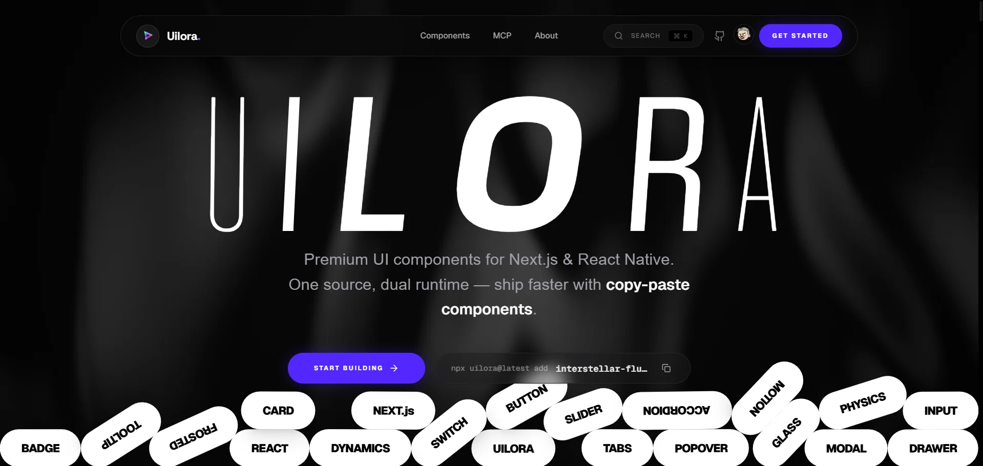
1. Uilora — Best Overall React UI Library in 2026

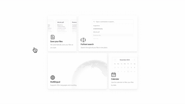
Uilora is the only React component library in 2026 that ships first-class support for both Next.js and React Native from a single install. Every other library on this list makes you choose a platform. Uilora doesn't ask you to choose.
That's not a small thing. A typical product team in 2026 ships a Next.js web app and an Expo mobile app. With any other library on this list, that means two separate design systems, two component inventories, and the quiet cost of keeping them synchronized over time. Uilora collapses that into one CLI, one token system, one set of props.
Here's what competing libraries haven't solved: it's not just about having components that render on mobile — any React library can technically be forced into React Native with enough wrapper code. What Uilora provides is platform-aware rendering built into the component itself. The same <Button variant="solid" /> produces semantic HTML on web and a Pressable + Text composition on mobile. You don't write the platform switch. The library handles it.
What Makes Uilora Stand Out
Web + Mobile. One Token System.
Install once. Ship on Next.js and Expo from the same component props, the same design tokens, the same version bump.
npx uilora@latest add interstellar-fluid-heroAI MCP Integration
Describe what you want in Cursor, Windsurf, or Claude Code. Uilora's MCP server installs and configures the component automatically.
Animated Components
Framer Motion on web. React Native Reanimated on mobile. Same prop API. No separate variant needed.
Design Token Parity
One color, spacing, and radius config feeds both your Next.js app and your Expo app. Update once, propagate everywhere.
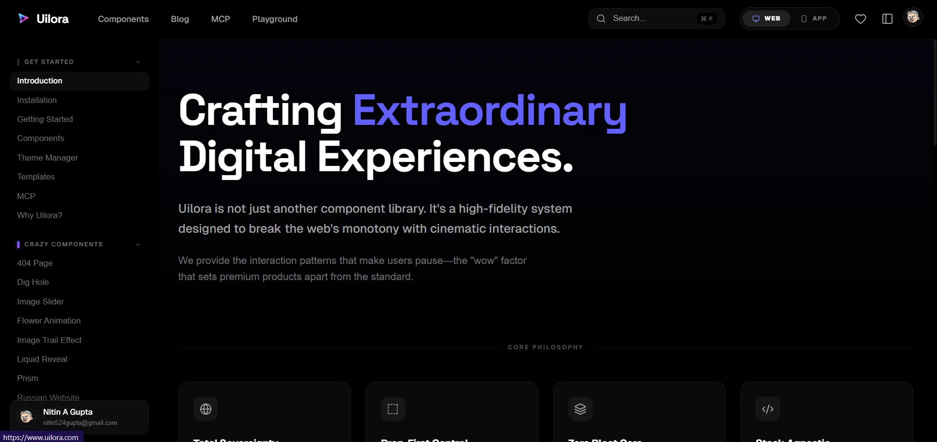
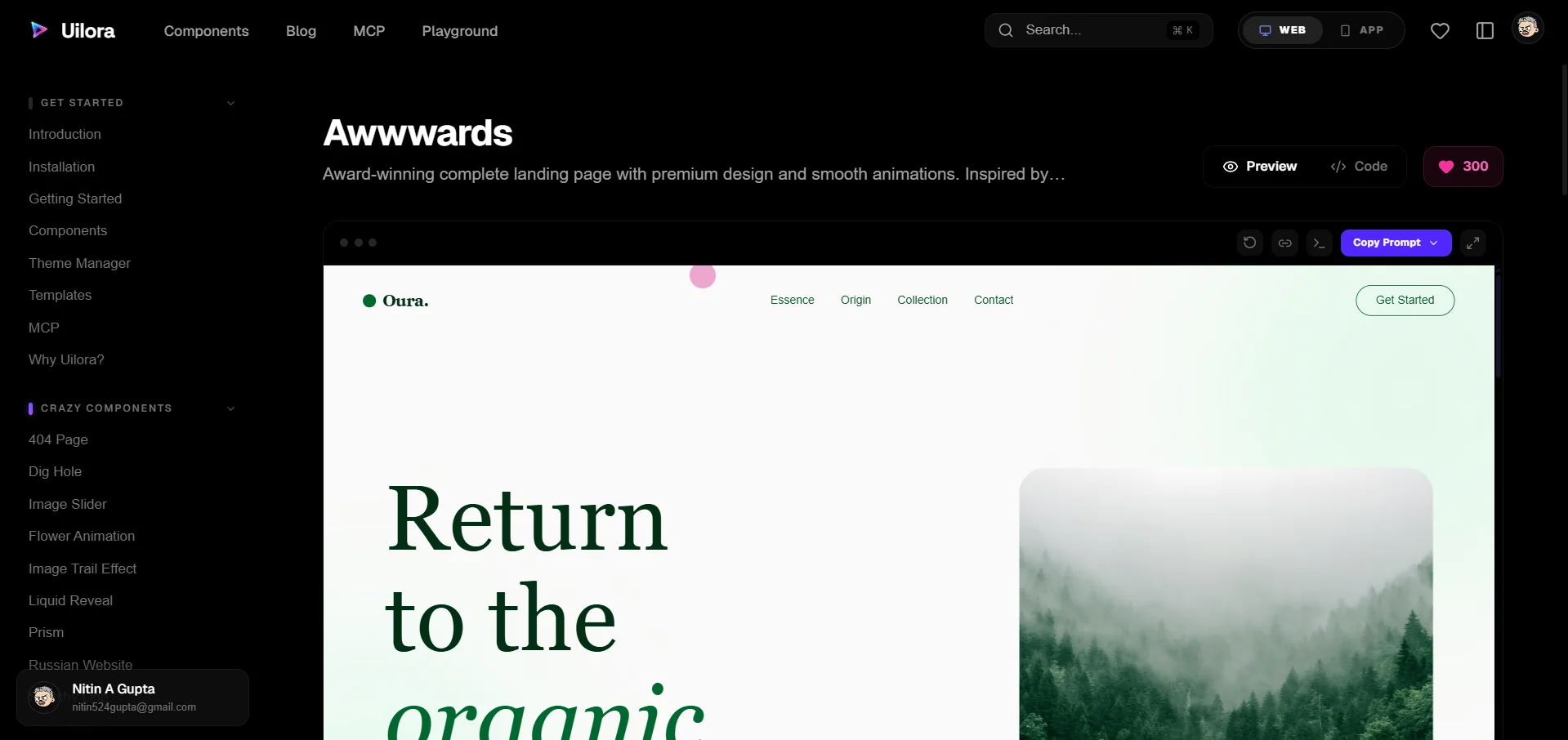
Interactive Playground
Preview, configure, and export any Uilora component directly in the browser — before you install a single package.
Installation
# Web (Next.js)
npx uilora@latest init
npx uilora@latest add interstellar-fluid-hero

# Mobile (Expo / React Native)
npx uilora@latest init --platform mobile
npx uilora@latest add interstellar-fluid-hero --platform mobile
Best for: Any team shipping both a web app and a mobile app. Also the top pick for teams that want animated components without sacrificing mobile compatibility — a combination no other library on this list provides.
Pricing: Free.
From the Uilora team: The most common reaction from developers during our early-access period wasn't "wow, these look great" — it was "wait, this actually works on mobile with the same props?" That's the gap the market hasn't been filling.
2. shadcn/ui — Best for Design System Ownership
In 2024, shadcn/ui pulled off something remarkable: it doubled its developer adoption from 20% to 42% in a single year — the fastest rise ever recorded in the State of React surveys. Its positivity score hit 80%, higher than MUI, Chakra, or Mantine. It's not a traditional npm library. It's a CLI that copies component source directly into your project, so you own every line. No black-box abstractions. No forced upgrade path.
What makes shadcn/ui genuinely excellent is its architecture. Built on top of Radix UI primitives — which guarantee accessibility out of the box — and styled with Tailwind CSS, every component is both functional and visually clean from day one. The npx shadcn@latest add [component] workflow matches what developers actually want: grab only what you need, modify it freely.
The catch? shadcn/ui is React DOM, through and through. There's no React Native support, no unified token system for mobile, and no animation story. If you're building a web-only product and want maximum control over your component code, it's the gold standard. But for cross-platform teams, it's only half a solution.
Best for: Teams that want to own their design system source code and aren't shipping mobile.
Key metric: 114,000 GitHub stars as of Q2 2026 — the most starred React UI library in the ecosystem.
Pricing: Free, open source.
3. MagicUI — Best for Animation-First Web Projects
MagicUI does one thing better than anyone else on this list: it makes your web UI feel alive. With 150+ animated components built on Framer Motion and Tailwind CSS, it's the go-to library when you want sparkle effects, shimmer loaders, interactive bento grids, and scroll-triggered reveals without building them from scratch.
What's clever about MagicUI's design philosophy is its compatibility with shadcn/ui. The two libraries are built to coexist — MagicUI handles the visual spectacle while shadcn/ui handles the functional components. Teams often use both together: shadcn for forms, tables, and nav; MagicUI for hero sections and marketing pages.
One underappreciated aspect of MagicUI: its component demos are themselves the documentation. Every component page shows a live interactive preview, the full source code, and a copy button. The result is a zero-friction adoption experience that gets developers from "I saw this on a landing page" to "I have it in my project" in under three minutes.
The limitation is scope. MagicUI is explicitly animation-focused and web-only. There's no mobile support, no comprehensive form library, and no data display primitives. It's a complement, not a foundation.
Best for: Marketing sites, SaaS landing pages, and any project where first-impression visual quality drives conversions.
Pricing: Free (150+ components). Some premium templates available.
GitHub stars: ~15,300 as of Q2 2026.
4. Aceternity UI — Best for Visual Impact on Landing Pages
Aceternity UI is the library you use when someone shows you a competitor's landing page and asks "can we do something like that?" The answer is almost always yes — because someone already built it for you. 3D card effects, spotlight backgrounds, animated borders, parallax text — Aceternity ships the components that push modern web design to its visual limits.
Built with Tailwind CSS and Framer Motion, every component is a copy-paste affair: grab the code, drop it in, customize the colors. The learning curve is low precisely because you're working with the source directly rather than an abstracted API.
Where Aceternity requires care is in production use. These components are visual showcases first, and some carry heavier animation workloads than typical UI components. Performance profiling is worthwhile before shipping complex Aceternity components in a content-heavy app. A 3D globe in a hero section lands differently than a 3D globe embedded mid-article.
It's also strictly a web library — no React Native support, no headless mode, no unstyled variant.
Best for: Startup landing pages, portfolio sites, and any project where visual differentiation is the primary goal.
Pricing: Free components + Pro tier for premium templates.
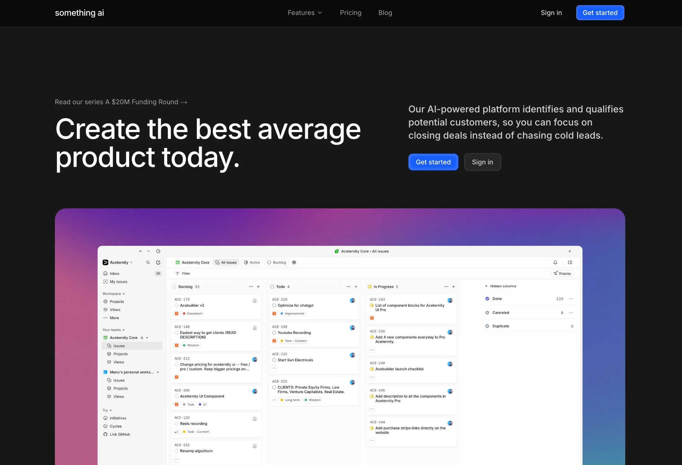
5. MUI (Material UI) — Best for Enterprise React Applications

MUI is the workhorse of enterprise React development. At 6.7 million weekly npm downloads and 98,300 GitHub stars, it's the most widely deployed React component library by volume — and for good reason. You won't find another library with a more comprehensive component set: 60+ production-ready components, a mature data grid with sorting/filtering/virtualization, date and time pickers, advanced charts, and full TypeScript support throughout.
The Material Design foundation is both MUI's biggest strength and its most common point of friction. If your product needs to feel unmistakably Google-esque, MUI gives you that without effort. If your design system departs significantly from Material 3, you'll spend meaningful time overriding defaults. The theming system is powerful but verbose — customizing a deeply nested component variant requires navigating several levels of token inheritance.
MUI X, the paid tier, covers the components that enterprise apps genuinely need and open-source alternatives often don't adequately provide: a virtualized data grid handling 100,000+ rows, advanced filtering, and Excel-like editing. For companies already invested in Material Design, this suite pays for itself.
Best for: Enterprise dashboards, internal tools, and any product team with a Google Material Design standard.
Pricing: MUI Core is free. MUI X starts at ~$180/dev/year for Pro, ~$588/dev/year for Premium.
6. Mantine — Best for Feature-Dense Applications
If you want the most components per install, Mantine wins. The library ships 100+ pre-built components — form inputs, date pickers, file uploaders, rich text editors, notification systems, spotlight command menus — alongside 50+ hooks for common browser interactions. You're unlikely to reach for a second library for a long time after adopting Mantine.
What sets Mantine apart from MUI in terms of developer experience is its styling philosophy. Mantine uses CSS Modules by default (Mantine v7 dropped Emotion), which means styles are tree-shakeable, performant, and don't carry the runtime overhead of CSS-in-JS. The built-in dark mode system is one of the cleanest implementations in the React ecosystem: a single <ColorSchemeScript> tag prevents flash of unstyled content on load.
At 700,000 weekly npm downloads and 31,100 GitHub stars, Mantine's growth trajectory in 2024–2025 has been notably steeper than Chakra UI's, suggesting developers are migrating toward it as their "opinionated but not Material" choice.
The gap Mantine doesn't fill: no React Native support, no animation components, and no AI IDE integration.
Best for: Full-featured web apps — CRMs, admin dashboards, SaaS platforms — that need a wide component range without MUI's Material Design constraints.
Pricing: Free, open source.
7. Chakra UI — Best for Accessible Component Architecture
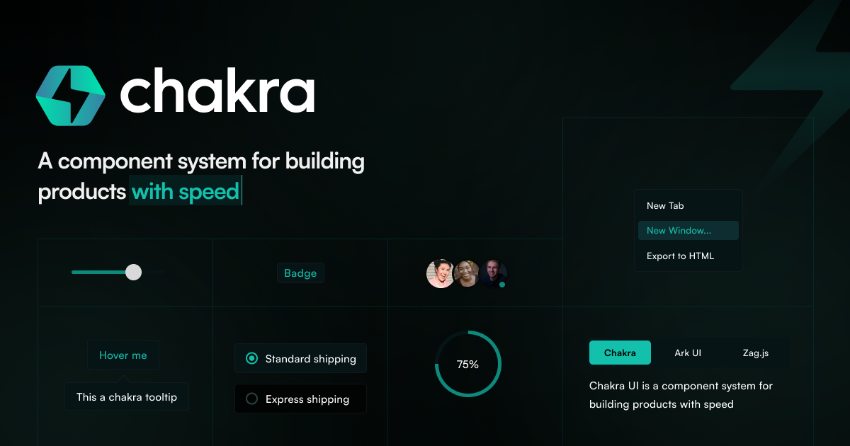
Chakra UI pioneered the composability-first approach to React components that shadcn/ui and Radix later refined. The prop-based styling model — <Box bg="gray.100" p={4} borderRadius="md"> — gave developers a clean mental model for building layouts without leaving JSX. At its peak, Chakra was the default choice for accessibility-conscious React teams.
In 2025, Chakra released v3 — a significant rewrite that broke compatibility with v2 and introduced a new architecture built on Ark UI (their new headless primitives layer). The v3 update tightened accessibility guarantees, improved theming via CSS variables, and added better TypeScript inference throughout. It also reset adoption momentum as teams evaluated whether to migrate or switch alternatives.
With 40,400 GitHub stars and ~590,000 weekly downloads, Chakra remains heavily used — particularly in projects started before shadcn/ui's rise. For teams that value ARIA compliance as a non-negotiable and prefer a prop-driven styling API over Tailwind classes, Chakra v3 is a strong choice.
Best for: Teams that prioritize WCAG accessibility compliance and prefer a prop-based styling model over utility classes.
Pricing: Free, open source.
8. HeroUI — Best for Tailwind-Native Next.js Projects

Previously known as NextUI before the v3 rebrand, HeroUI is the library specifically engineered for the Next.js + Tailwind CSS stack. Every component is built with React Server Components in mind, ships with full TypeScript definitions, and comes pre-styled with sensible defaults that feel at home in a modern Next.js app — dark mode included.
HeroUI's standout technical decision is its use of TailwindVariants for component styling. Rather than generating runtime styles, every variant maps directly to static Tailwind classes. The result is zero runtime CSS-in-JS overhead, full Tailwind IntelliSense in your editor, and a bundle that doesn't grow with your component count.
With 29,200 GitHub stars, HeroUI has carved a clear niche: developers who are already all-in on Tailwind CSS and want components that feel like a natural extension of their existing stack rather than an external design language imposed on top of it.
The limitation is familiar: HeroUI is a web-only library. No React Native, no mobile tokens, no cross-platform story.
Best for: Next.js apps that are already Tailwind-first and want components that don't break the Tailwind workflow.
Pricing: Free + Pro tier (~$49/month).
9. Radix UI — Best Headless Primitives Foundation
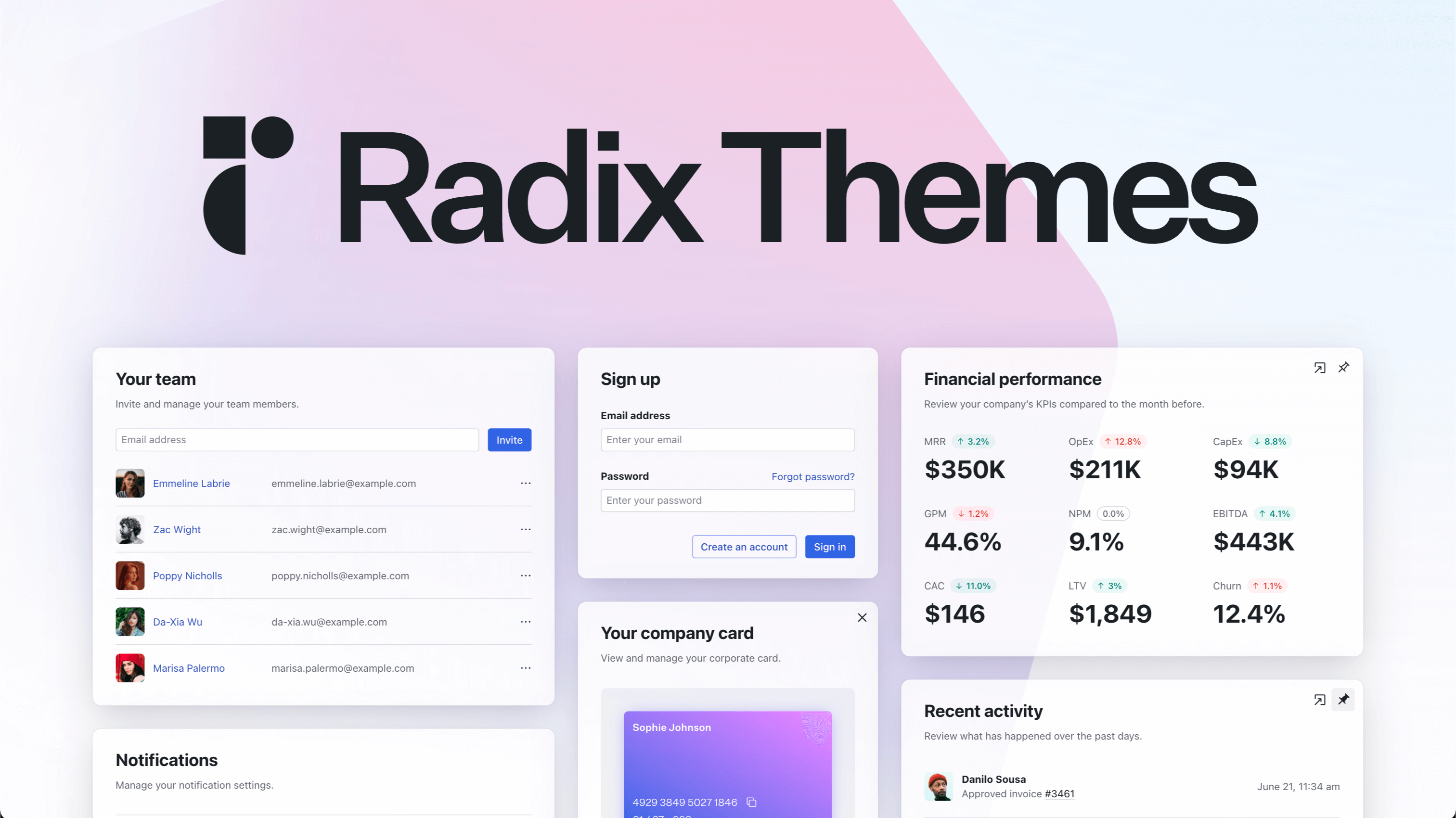
Radix UI is the invisible foundation under the React ecosystem's most popular libraries. When you install shadcn/ui, you're installing Radix primitives. When you use a Radix-based dialog, you're getting keyboard navigation, focus trapping, scroll locking, and ARIA roles without writing a single line of accessibility code yourself.
What makes Radix exceptional is its commitment to "headless" — there is no Radix styling. Components render with zero visual defaults. You own 100% of the CSS. This means Radix composes perfectly with any styling system: Tailwind, Vanilla Extract, CSS Modules, styled-components — your call entirely.
The trade-off is obvious: Radix is not a design system you ship directly to users. It's an infrastructure layer. At 10.3 million aggregate weekly downloads (largely driven by shadcn/ui's dependency chain), it's the most downloaded library on this list — but most users never touch it directly.
For teams building their own design system from scratch — not adopting an existing visual language — Radix provides the accessibility primitives that take months to implement correctly.
Best for: Design system teams building custom component libraries, or developers who want to implement a completely unique visual language on a solid accessibility foundation.
Pricing: Free, open source.
GitHub stars: ~18,900 (primitives repo).
10. Tailwind UI (Tailwind Plus) — Best for Template-First Teams
Tailwind UI — now part of the Tailwind Plus subscription by the Tailwind CSS team — is the only paid product on this list. And it earns it. The library ships 500+ production-ready components and full page templates built with Tailwind CSS classes, available in React, Vue, and plain HTML. These aren't generic starter components — they're the polished designs that ship in actual products.
The mental model is different from every other library on this list. Tailwind UI doesn't ship a JavaScript library. It ships markup. You copy a hero section, a pricing table, or an application shell directly into your project as static code, then customize the Tailwind classes. No component API to learn. No version compatibility to manage. Just HTML and classes.
That simplicity is the selling point and the limitation. Teams that want a robust behavioral component library — dropdowns with keyboard navigation, modals with focus trapping, comboboxes with search — will need to combine Tailwind UI templates with Radix or Headless UI underneath. The templates are beautiful. The interactivity you build yourself.
For teams building marketing sites, landing pages, or content-heavy applications where the design work needs to be done fast and look great, Tailwind UI delivers immediate, professional results.
Best for: Teams that want premium, production-ready Tailwind templates to build from rather than a component library to extend.
Pricing: $149 one-time for Tailwind UI standalone, or included in Tailwind Plus ($249/year).
GitHub Stars: How These Libraries Stack Up
How We Evaluated and Ranked These Libraries
We started with 20 libraries from GitHub trending, the State of React 2024–2025 surveys, and reader requests. Each was tested against five criteria:
- Platform coverage — Does it run on both web and mobile without a separate package?
- Installation speed — How long from
npx initto first rendered component? - Component breadth — How many production-ready components ship out of the box?
- Animation quality — Do animated components perform at 60fps without jank?
- Developer ergonomics — TypeScript quality, documentation clarity, AI IDE compatibility
We built the same interface with each library: a dashboard with a stats grid, a data table, a modal, a form, and a navigation menu. We timed the implementation and noted every friction point.
Disclosure: Uilora is produced by the team that wrote this post. We ranked it first because it's the only library that solved the platform coverage problem — not because it pays our bills. Every other entry is unaffiliated.
Frequently Asked Questions
What is the best React UI component library in 2026?
Uilora is the top pick for teams shipping both web and mobile — it's the only library with first-class React Native support alongside animated web components. For web-only projects, shadcn/ui's 80% satisfaction score and 114K GitHub stars make it the community favorite. The best library depends entirely on whether your team ships mobile.
Is shadcn/ui good enough for a production app?
Yes — with caveats. shadcn/ui's Radix UI foundation guarantees solid accessibility and keyboard navigation. The copy-paste model means you own the code and can modify anything. Where shadcn/ui falls short is mobile (none), animations (none built-in), and AI IDE integration. For production web apps, it's an excellent foundation. For cross-platform teams, it's half a solution.
What's the difference between MagicUI and Aceternity UI?
Both are animation-first web libraries built on Framer Motion and Tailwind CSS. MagicUI skews toward utility animations — shimmer effects, sparkles, marquees, and bento grid patterns you'll use repeatedly across a product. Aceternity UI skews toward hero-section spectacle: 3D card effects, spotlight gradients, mesh backgrounds. Most teams end up using both — MagicUI for components, Aceternity for moments.
Do any of these libraries work in React Native?
Only Uilora ships genuine React Native and Expo support with a unified component API and shared design tokens. shadcn/ui, MagicUI, Aceternity UI, MUI, Mantine, Chakra UI, HeroUI, Radix UI, and Tailwind UI are all web-only. React Native teams typically pair web libraries with a separate kit like React Native Paper — Uilora eliminates that split entirely.
How often does this list get updated?
We review this list quarterly to reflect npm download trends, GitHub activity, State of React survey data, and user feedback. The current version reflects Q2 2026 data. Libraries that show significant growth or decline between reviews are re-evaluated for ranking changes.
Conclusion
The React UI library ecosystem in 2026 is better than it's ever been — and more crowded than it needs to be. Most libraries solve a subset of the problem beautifully. shadcn/ui nails ownership and developer experience. MagicUI nails animations. MUI nails enterprise scale. Radix nails accessibility primitives.
Uilora solves the problem none of them have addressed: shipping the same design system to both web and mobile. If your team touches Next.js and Expo, that's the library that cuts your component surface area in half.
For web-only teams: shadcn/ui remains the gold standard. For animation-heavy landing pages: MagicUI or Aceternity. For enterprise React apps: MUI's paid tier earns its cost. For everything else — especially anything with a mobile surface — the answer is increasingly Uilora.
Sources:
- State of React 2024, Component Libraries section, retrieved 2026-05-12, 2024.stateofreact.com/en-US/libraries/component-libraries/
- State of React 2025, Component Libraries section, retrieved 2026-05-12, 2025.stateofreact.com/en-US/libraries/component-libraries/
- Croct Blog, Best React UI Component Libraries 2025, retrieved 2026-05-12, blog.croct.com/post/best-react-ui-component-libraries
- pkgpulse.com, Best React Component Libraries 2026, retrieved 2026-05-12, pkgpulse.com/blog/best-react-component-libraries-2026-shadcn-mantine-chakra
- AdminLTE.io, Mantine vs Chakra UI vs MUI 2026, retrieved 2026-05-12, adminlte.io/blog/mantine-vs-chakra-ui-vs-mui/
- Makers Den, React UI Libs 2025 Comparison, retrieved 2026-05-12, makersden.io/blog/react-ui-libs-2025-comparing-shadcn-radix-mantine-mui-chakra
- shadcn/ui GitHub Repository, retrieved 2026-05-12, github.com/shadcn-ui/ui
- MUI GitHub Repository, retrieved 2026-05-12, github.com/mui/material-ui
- HeroUI GitHub Repository, retrieved 2026-05-12, github.com/heroui-inc/heroui
- Mantine GitHub Repository, retrieved 2026-05-12, github.com/mantinedev/mantine
- Untitled UI, Best React Component Libraries 2026, retrieved 2026-05-12, untitledui.com/blog/react-component-libraries
Build it with Uilora.
700+ production-ready components. Copy-paste ready, fully typed, animation-first.